Designing for Effortless Connection
The Problem
In the Western market, people still juggle separate apps to chat, pay, and manage their digital lives. This constant switching creates friction and limits opportunities for deeper user engagement and business growth.
The Result
Led the design and product direction for a seamless chat and payment platform that connects people and money in one intuitive experience.
THE BACKGROUND
Behind the Vision
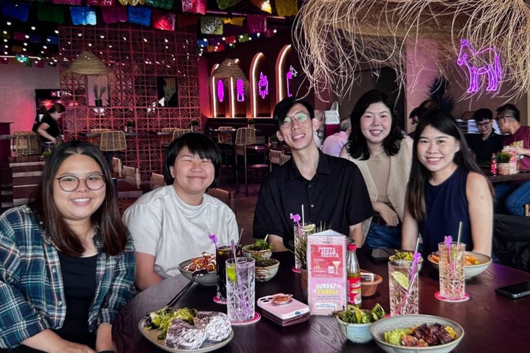
The project was built by a small, cross-country team of designers, engineers, and product managers united to make payments and communication effortless, connecting everyone, everywhere.
Roles and Responsibilities
As part of payment team, I brought my background in payment design and systems thinking to bridge the gap between product vision and user experience. My experience working with payment infrastructures allowed me to contribute to discussions on transaction flows, trust, and compliance, ensuring the product was not only visually seamless but also financially reliable, scalable, and secure.
As the product designer, I led end-to-end design across multiple domains, including chat and payments, while collaborating with the product design team to build a unified design system across iOS, Android, and desktop. These efforts improved design consistency and development efficiency, and also delivered measurable business value by enhancing user engagement, increasing payment success rates, and creating a scalable foundation for future growth.
THE CHALLENGE & APPROACH
From Challenge to Clarity
Working within a fast-paced startup environment came with several challenges. Timelines were often tight, requiring quick iterations and efficient collaboration across time zones. The existing app also carried legacy design and payment limitations, which added constraints to the overall user experience.
The Issues
We were designing specifically for U.S. users, a market I wasn’t fully familiar with at the start. Their digital habits, expectations, and decision patterns differ noticeably from Singapore users, so I couldn’t rely on assumptions or past experience.
At the same time, there were many stakeholders with different ideas of what “good” should look like. The real problem became finding clarity and understanding what users actually need while aligning everyone internally around one direction.


Research & Discovery
Since this was a new market for me, I knew there was a lot more groundwork to cover. I spent extra time diving into:
User interviews with users in US to understand how they think and decide
Competitive research from current bank and payment apps to see what patterns they’re used to
Heuristic evaluations to challenge our own assumptions
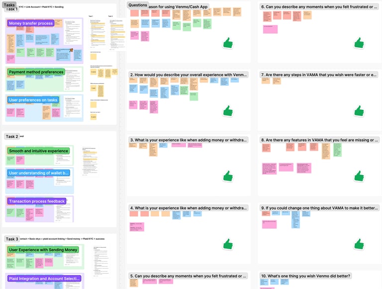
Synthesis & Alignment
With so many different viewpoints, alignment was crucial. I consolidated stakeholder feedback, compared it against what users told us, and mapped out gaps between assumptions and actual behaviour. This has helped me form a clearer strategy grounded in real user needs.
Outcome
An MVP that captures the core experience aligned to U.S. user behaviour. Given the tight timeline, the focus was on building a solid and scalable foundation. The one that meets immediate user needs while leaving room for future refinement and expansion.
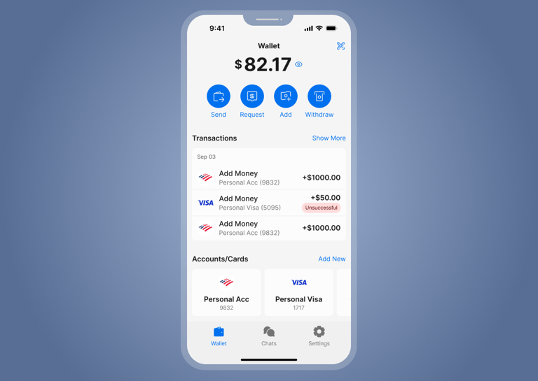
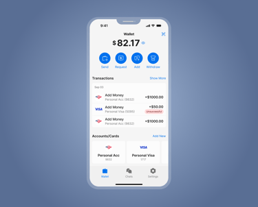
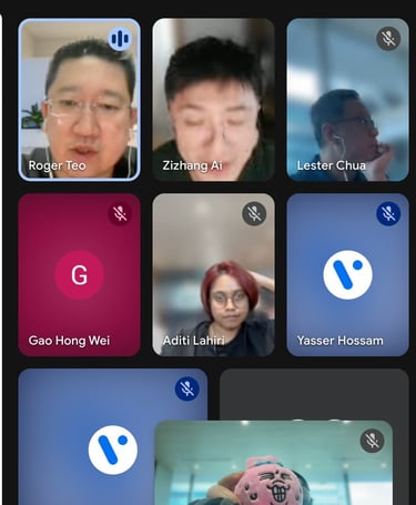
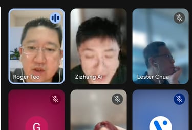
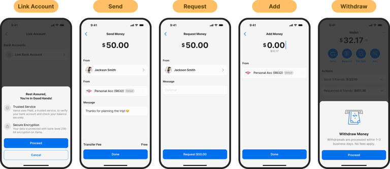
A key feature included in the MVP is the chat interface with built-in send/request money actions.
Allowing communication and transactions in a single, seamless flow instead of switching between multiple screens or apps.
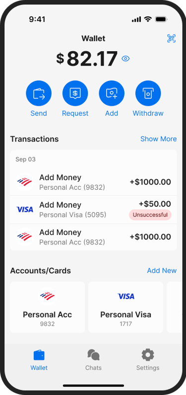
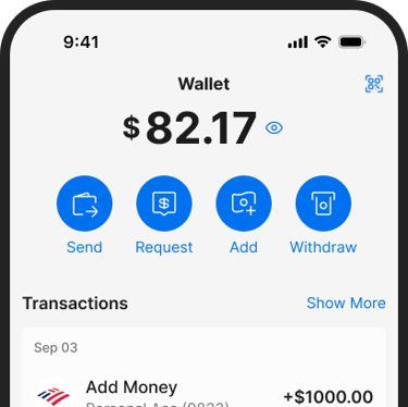
We also included a set of essential wallet features to form the backbone of the MVP.
These features are based on baseline expectations gathered through competitive analysis and user interviews. Users emphasised the need for a wallet app to provide clear control over their funds, easy onboarding, and transparent money movement.
Combining these core wallet functions with the conversational flow enables a complete, user-centric money experience right from the MVP that's functional enough for real-world use and scalable enough for future development.
Success Metrics
To evaluate whether the MVP meaningfully reduces friction and supports natural, conversational money movement, we defined four measurable success indicators. These metrics focus on validating both behavioural adoption and feature effectiveness:
Wallet Activation Rate: Percentage of users who complete KYC and successfully link their accounts after discovering the core wallet features.
This helps us understand whether onboarding and wallet value are clear and compelling.
Chat-to-Wallet Action Rate: The volume of send, request, or split actions initiated directly from the chat interface compared to the traditional wallet tab.
Higher usage from chat signals reduced friction and stronger alignment with U.S. user habits.
Drop-Off Rate After Money Conversations: Measurement of users exiting the app after discussing expenses or payment details.
A decline in drop-off indicates that integrated chat + transaction flows are keeping users engaged through completion.
Peer Transaction Frequency: Growth in weekly active peer-to-peer transfers between users.
This reflects whether the MVP successfully encourages ongoing, repeat money interactions within the app.
THE LEARNING & REFLECTIONS
Beyond the Job
Who knew building a global chat and payment app would teach me just as much about human connection as it did about design systems?
Working together with the great talents taught me how to balance speed with intention. Tight timelines and evolving requirements pushed me to make decisions confidently, communicate clearly, and trust the team’s collective expertise.
Working in a small, distributed design team required strong communication and shared problem-solving. We held weekly design syncs to align on ongoing work, discuss challenges, and collectively plan solutions. To push creative thinking further, we organised design jams to quickly ideate and prototype new approaches together.
Through this experience, I deepened my understanding of how payment systems, user behavior, and design scalability intersect, and learned the importance of designing not only for usability, but also for business growth and long-term adaptability.